This. %100 this. The airline industry figured this out years ago with some of the cockpit controls. (admittedly there are a lot of other buttons and switches for the pilot to worry about too, but it seems like the digital display panels always are flanked by rows of buttons which were used for interacting with the panel. Works great even with gloves on and does not lock you into a single feature set.
Lab equipment does the same thing. Decades ago, oscilloscopes started having banks of buttons corresponding to an area of the screen, and knobs that have context sensitive functionality.
Those can be placed side by side with buttons that have fixed purposes delineated by printed or debossed lettering.
I realize that we're getting pretty far from the automotive use-case, but this style has worked remarkably well over the years, and has made it into all sorts of equipment.
A few months ago I met a teen (maybe 15 y.o.) who was trying to withdraw money from an ATM that had a non-touch screen. He kept failing and trying to tap on the screen.
He was doing it for his grandfather, a wheelchair user, who was nearby. The grandpa couldn't use the ATM himself because there was no wheelchair ramp. Seeing the teen's failing attempts he started asking passerby for help.
My takeaway from this story: we need more wheelchair ramps, not touchscreens.
Seconded. Touchscreens are great in many contexts but I have never liked them on atms. The latency between tapping something and the result might be the bank checking my account balance, or might be something wrong with the UI. When I'm dealing with money stuff I don't want any distracting ambiguities.
Having said that I like machines enough that I assume I can figure anything out because it was intended to be used by someone, so I rarely struggle unless it's a truly awful design. Touchscreens are way more intuitive for most people, though in cases such as you describe I wonder what the helpless people think the buttons outside of the screen are there for and why they're reluctant to try pushing them.
I suppose it doesn’t rain much in your area? Buttons tend to work even when moist. Touch screens tend to give you the wrong amount of money out of your bank account.
This varies widely depending on the issuer of the ATM, at least in my part of the EU (SW Germany).
My banking group has (I guess) >90% of their ATMs indoors; I can only think of ever using 4 or 5 locations that were outdoors (my dataset is probably something like 100 ATMs). But there are also some banks which seem to favour outdoor, or at least have less of a strict "indoor policy".
Especially "generic" ATMs at tourist spots or train stations seem to be outdoors.
When did you last vote? The 2016 election is when I first experienced them. I asked to vote by paper as I wasn't comfortable with electronic voting machines, so they gave me a paper and pen to fill it out, which I was then to feed into the computer.
That's not how it works outside the US. In Germany you fill out the bubbles and throw it in a ballot box. The cobtent of the box is later counted by multiple actual people. Results are very accurate and almost instantly available after voting closes. Thousands of voting locations, properly staffed, make sure of thay. Those preliminary results are later recounted and verified.
> I don't see how that affects the comments you're replying to in any meaningful way. They only mentioned a particular election to establish a timeline.
Because many countries won’t have had a meaningful difference in election systems in that window?
Commit... asked Swen... when they last voted. Now that question is only meaningful if the region Seen... lives in even uses e-voting, so Commit... seems to either assume that Swen... lives in the same country or that virtually all countries use e-voting.
Either option is US-centric - the first is pretty obvious, the second is more along "we do it like that, so all the others probably do it like that as well" (I'm US-centric as well, assuming the mentioned 2016 election was the US presidential election).
It's not like this is inherently bad or anything like that, it's just a remainder that sometimes the inhomogeneous composition of the HN commenters should be considered. And as you pointed out, that's also the case inside the US.
Also, others used the opportunity to state how their country/state uses (no) computers for voting. So there seems to be some meaning to it.
Maybe it's centric to CommitSyn's experience, but I don't think it's US-centric.
> the second is more along "we do it like that, so all the others probably do it like that as well"
2016 is quite recent for a first encounter anyway, so I don't see it as "we do it like that", just an anecdote that it's spreading. No "others probably do it like that".
I'm also surprised to see "electronic voting machines" referred to as something everyone ought to be familiar with. I've never seen one of this type. I last voted a year ago (it was a local election); the last national election was two years ago.
I have seen the bubble sheet type, but the voter interface to those is a pen and paper.
It didn't make waves here presumably because people are jaded with politics, but people in this sub-thread might be interested in this recent story about a quasi-legal effort to penetrate electronic voting infrastructure in the wake of the 2020 election.
The 1st election I voted in was 1987 and the last was a couple of months ago. For the 1st couple of elections I used the giant old school mechanical voting booths with the levers you threw to record your votes.. Since the early 90s I have only used ballots which I filled out by hand and then ran through an optical scanner before leaving the polling place. I imagine quite a few people in the US have never seen an electronic voting machine.
Last time I voted, there was a machine which spat out a paper where you could verify your answers, which was then fed to another machine for counting.
Seems like a reasonable path to me, though I'm still a bit distrustful of the whole process (I live in Texas currently, so Shenanigans(TM) are not out of the question).
That's only half stupid. The last primary I voted in I used a poorly-designed-by-committee interface which then printed out my ballot which I then fed into the scanner.
The style where it prints out a ballot which you feed into the scanner is actually not-insane. It's good for accessibility (e.g. lets visually impaired people vote without assistance) but still leaves a paper trail for recounts and things.
It is weirdly hard to have conversations about insecure voting machines these days. Progressive that care are sometimes shouted down by other progressives that are in favor of dominion suing fox. Conservatives that care are sometimes trying to justify disproven conspiracy theories about the most recent election.
It seems both sides have reason to push for voter-verifiable paper trails, but I'm not seeing a lot of momentum along those lines legislatively.
If you look at those MFDs, many also have rotational controls in the corners (some even have two levels of dials, one sitting on top of the other), which are another key way to keep the UI tactile and promote muscle memory.
Things like eliminating lag, organizing menus into predictable paths that can easily be committed to muscle memory, and designing buttons and dials that can be used even in high vibration environments, are all key design criteria for these cockpit controls. It's so sad that automotive design refuses to take any lessons from that industry.
When using the touchscreen in my old Nissan Leaf, I used to anchor my thumb underneath the display so I could hit controls reliably via muscle memory even when the road was bumpy. Preposterous that we have to do these kinds of hacks when there are much better solutions.
This comment reminds me of this video, where a F-15C fighter pilot breaks down the "Human Interface" in the cockpit where there are over 250 buttons and various other displays including HUD and panels and a button they aren't allowed to press because it requires an engine rebuild afterwards:
https://arstechnica.com/features/2020/06/human-interface-com...
It suggests it was meant to be part of a series but I've not found any other examples????
I was going to cite the example of the Garmin G1000 glass cockpit. Even moving a cursor around a map requires pushing a physical knob in 360° to guide it.
I wouldn't call the Garmin G1000 a paragon of UX design though. I wish there were some serious competitors that would give the UX another try (like Avidyne), but Garmin seems to be the standard now.
Philip Greenspun wrote about some of its problems (back in 2006):
> In some ways this makes life more difficult for the pilot. For example, suppose that you are busily trying to fly the airplane and study an approach plate when ATC gives you a new transponder code. With a less integrated system, you know exactly where the buttons are to enter a transponder code and your fingers will find their way there almost automatically. The buttons are always in the same place, i.e., on the physical transponder box, and they never change their function. With the G1000, you find the soft key labeled "xpdr" and press it. Then some more soft keys take on the function of digits. It is clearly a less direct and more time-consuming procedure.
Similarly for entering a frequency into COM 2. With a traditional radio stack, you reach over to COM 2, which is probably underneath COM 1 and labeled "COM 2". You twist the knob that is always there and that always adjusts the COM 2 frequency. With the G1000, you study the COM freqencies display (typically four numbers) and figure out which number is surrounded by a box. This is the number that you are going to be changing if you twist the COM knob. If the box isn't surrounding the number you want to change, you have to think long enough to push the COM knob to toggle between "I'm adjusting COM 1" and "I'm adjusting COM 2" modes.
> A 1965 Cessna has what computer nerds would call a "modeless interface". Each switch and knob does one thing and it is the same thing all the time. This is a very usable interface, but it doesn't scale up very well, as you can see by looking at the panel of a Boeing 707. Both the Avidyne and the G1000 have some modal elements. Knobs and switches do different things at different times. The G1000 is more deeply modal and therefore, I think, will always be harder to use.
> I wouldn't call the Garmin G1000 a paragon of UX design though.
In some ways I would.
I wouldn't call it "intuitive," but once you understand its semantics, it's phenomenally predictable in its behavior. And quite well thought through I think. Here's one of my favorite examples: On the MFD, in an urgent situation, two of the most helpful pages are the "map page," and the "nearest page." These are (unintuitively) the first and last page. Until you realize that that means you can access both without looking which page you're on by spinning the page knob either all the way left or all the way right.
It isn't perfect, but I find it generally well thought through.
I certainly can't argue with the points about transponder and com1/com2 inputs, but within the parameters for the device, I consider the UX for the G1000 to be ... maybe not a paragon in its entirety, but certainly much more thoughtful than what I encounter in other life daily.
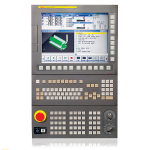
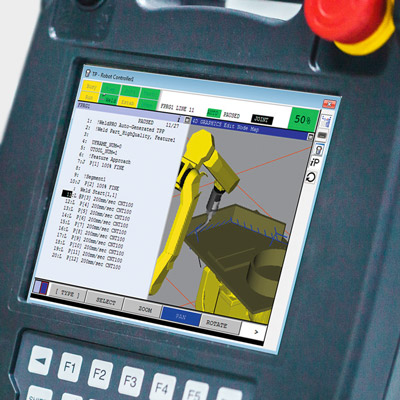
CNC, robotic, and industrial equipment too: Human-machine interfaces have rows of "Soft keys", buttons whose function changes depending on the context. Many machines used soft keys in the ages before touchscreens were available, but manufacturing is slow to change and even with the advent of multi-touch high-resolution color displays, they've remained. For examples:
I'm not so sure that's an optimal solution. If you are going to use the display to show the UI, you may as well just use touch interface, as long as it is responsive enough. Physical controls make more sense when they are optimized for ergonomics so that they can be used without looking.
> If you are going to use the display to show the UI, you may as well just use touch interface
This is just absolutely not true in practice.
Many synthesizers have the described design where you have a set row of knobs or buttons and what those controls do changes based on the current mode or state. A screen tells you the current function of each control.
It is much easier to build up muscle memory that lets you grab the right control and do what you want than it would be if you had to interact with the screen itself. The difference is so stark that it's hard to even explain if you haven't experienced it first-hand.
And this is for musical instruments used in live performance, often in the dark, where muscle memory and interacting instantly and correctly is vital.
Exactly, trying to use a software synth without some sort of hardware interface with physical controls becomes a nightmare very quick in any situation that isn't just sitting on your computer at 12am leisurely editing synth patches.
The same it turns out is true of steering a multi-thousand pound metal rolling deathbrick.
Even those kinds of modal interfaces with physical knobs/switches/buttons are often regarded as clumsy and aggravating compared to knob-per-function interfaces where everything control does just one thing and always that one thing.
I think the point here is that most people who use the interface a few times will learn the necessary key sequences. This learning can happen with the car at rest, and after that the user can keep their eyes on the road. It's not perfect, as some people have a slower learning rate than others, but it's sure better than a touch screen.
Well, if the control all change in meaning depending on the interface state, you can only memorize sequences if there is a reset somewhere. And those will probably be very cumbersome sequences.
A "home" is a reset. A "back" button won't solve the issue.
On a second thought, if the options are hierarchical, the sequence of clicks may not be cumbersome at all. Also, in a car the state can be something really easy to keep track of, like "the car is running", but even then, I'm not sure it's safe to rely on this.
Most of the ones I have used allowed you to navigate the UI using physical buttons on the steering wheel. Something similar to a up/down/select/back button group with some other specific buttons for frequent actions.
Yes, buttons on the steering wheel are ones of the most useful ones, though even they become capacitive e.g. in new VW, BMW, Tesla Plaid.
I have a VW car with a basic HUD (2015-ish era HUD, where a glass pops up). It can show lane keeping state, adaptive cruise control, current speed, recognized signs and navigation directions. Those features are essential for normal driving, so I don't look at all on the instrument cluster (either dials or the screen). The fact that you don't need to look down and change the focus of the eyes makes a significant difference.
That's fine if the controls work without significant lag. Last week I drove a minivan whose blower speed was controlled by a multi-purpose knob, and each speed change took several SECONDS to be affected. Pathetic.