The article is close, but doesn't quite get there. The problem is not the image itself or how it's taken, but rather how it's displayed. When you look at the world through your eyeballs, your brain recreates the scene so that it wraps around an imaginary point in mental space, so to speak. Things that are to your right "appear to your right" in your mind. When you're looking at a photograph, regardless of how much field of view it was taken with, it's displayed in a very small portion of your entire field of vision, even if you're looking at it on a computer monitor; it's even worse if you're looking at it on a phone. You're basically always looking at it zoomed out. It would be possible to recreate the scene exactly as it would have appeared if your eye was where the camera was when the photo was taken, but you'd need to blow it up on a huge screen, like a movie theater screen, and stand fairly close to it. Then you'd be able to see that actually most lenses other than fisheyes have fairly narrow field of views.
I was looking for someone commenting this. There's no mystery, it's really just geometry. Imagine casting a ray from your eyeball to a pixel on the monitor. Then imagine the same ray at the same angle on the actual scene. If the pixel matches the correct part of the scene, then the image appears natural.
But that's really a tiny field of view. Perhaps the easiest way to see this is that it's the same geometry as having a monitor-sized window in a wall at the same distance, and looking outside. That would be really tiny window, and you wouldn't expect to see much of the outside without getting a lot closer.
As a result, most pictures are taken at a wider field of view than what would be natural for typical viewing distances, to show more of the scene. Which explains the distortions that make everything at a distance appear tiny.
You fundamentally can't "solve" this without dramatically increasing the FOV that you're viewing things with -- VR being the obvious idea.
The mystery is "why can I view the world with my eyes and see a wide angle, straight lines, and "natural" perspective, but when I take pictures with a wide angle, everything looks "weird."
You can throw away the straight lines and shoot with a fisheye lens (no straight lines, wide angle, fairly natural depth), you can crop in (depth fine, but now I'm missing stuff around the edges), and you can shoot with a wide rectilinear lens (wide angle, straight lines, "exaggerated" perspective).
As far as I know, the answer is simply that your eyes aren't rectilinear but your brain fudges it to make straight lines seem straight when the image on our retina actually curves.
The effect is most prominent when standing in a small room. It's impossible to take a single picture of it that conveys what you want: a wide rectilinear lens will exaggerate how big the room is (and look weird around the edges), a "normal" rectilinear lens will be so cropped in that you can't see most of the room, and a fisheye lens will make all straight lines curve, especially around the edges. None of them really represent the visual experience of being in the room. Just look at how weird real-estate listings can get when they try to show you a picture of a small bathroom.
The problem isn't taking the photo, but that the size you are viewing the photo at is simply too small and flat. Human field of view is somewhere around 200x130°, you are not going to capture that on a tiny flat bit of paper which might just be 40x30°. Reaching the 200° isn't even possible with a flat photo. You can try to make it aesthetically pleasing, but you can't make it accurate without making it bigger and curved.
When you enlarge the photo and display it at the field of view it was captured at, as you can do in VR, the whole problem disappears and the photo just looks like the real world. Use two cameras and it'll even be in 3D.
If you drop the requirement that you have a reasonably-sized flat image, you can get a perfect representation... as long as you stand in exactly one spot to view it (or throw it into VR).
If you intentionally use a nonlinear perspective like the Turner painting in the article, you can get an image that looks great flat, and still produces a wide angle of view and "natural" dense of depth with low perceived distortion, and will look fine from across the room or up close. It probably does a better job of recreating what it is like to be there than a mechanical linear perspective photograph. The only problem is you can't get images like that out of a camera.
Probably a big part of it is that the high-resolution area of the retina is quite small. So in that small area, the perspective is close to perfect, and then we mentally stitch together a larger image by moving our eyes around. But the larger image that's stitched together is in the shape of a sphere rather than a flat surface, with each point on the sphere corresponding to a direction the eyes could be pointing.
Yes. Also image aspect ratio and the relationship between horizontal and vertical is complex. Our eyes themselves move reasonably comfortably 15 degrees in all directions (maybe a little less up), but peripheral vision is greater in width than height and we are used to turning our heads to see objects in horizontal field of view more than vertical.
> As far as I know, the answer is simply that your eyes aren't rectilinear
That's true, but not the problem. Think about this logically. The goal is to show the exact same color at the same angle. If you achieve that (possible with VR, also possible with a normal photo but for a tiny angle only), it doesn't matter how the eye or processing in the brain warps the image afterwards.
Though you can't solve it to be geometrically correct, that doesn't mean you can't find a projection that is perceptually better than all the simple ones. That seems to be what artists are doing with their ad-hoc tweaks. TFA mentions a computerized one near the end that seems to be aiming for that too. Or you could imagine some clever ML algorithm that might treat different objects differently, not just remapping pixels blindly.
An easy way to make your point is to do what "artistic types" in e.g. cartoons do to make a viewfinder to estimate a shot: use your thumbs and forefingers in front of your face to make a rectangular "window." Now recognize how much smaller this window is than your field of view.
That's exactly how I came to understand the effect. I was looking at a picture of a sunset I had taken and wondering why the sun looked so much smaller than when I was there. I remembered that the sun, like the moon, is roughly the size of the thumbnail when the arm is completely stretched out, so I zoomed in the image until the sun was the right angular size, and the sizes of all the objects then appeared as in real life, only observed through tunnel vision.
While I was reading this article I actually pulled out my phone and moved it around near my eye until I could get the camera picture to 'line up' with its surroundings. It was indeed possible (and somewhat trippy), but the phone was about 2.5" from my eye. So yeah, assuming you're not holding your phone that close (as no one is, since few people can even focus that close, myself included,) it's going to be smaller than reality.
They mention this under the "What if there is no true perspective?" section:
Second, they point out that viewers almost always view pictures from the “wrong” location. A cornerstone of linear perspective is the idea that the viewer must be at the focal center of the image to view it correctly. If you view a linear perspective image from the focal center, it should be like looking through a window—indeed, Leonardo da Vinci wrote that linear perspective images only work from the focal center. Yet, in reality we don’t do this. Most of the photos we look at would have to be viewed with one’s eye a few inches from the page. People in art galleries walk all around and view paintings from all sorts of angles. Hence, the whole idea of linear perspective falls apart.
Perspective is a huge challenge in photography, in some respects a central challenge.
Here's [1] an image, made with a rectilinear lens, which manages to convey oodles of depth and structure. It is difficult to overstate how challenging it can be to express that level of depth in a flat image.
When people talk about how a focal-length "compresses" or "exaggerates" an image, what they're really talking about is perspective. Each field of view carries with it its own perspective.
Variable focal-length ("zoom") lenses encourage us to select our subject and composition first, then choose a perspective to match. Frequently, it is more important to begin with our desired subject and the perspective with which we wish the viewer to see it (focal-length), then figure out how to build a composition to match. A 24-70 mm lens isn't really a lens, it is at least six lenses with significantly-different perspectives: 24, 28, 35, 40, 50, and 70mm, each of which can take a lifetime to master.
One can deliver the perception that Hertzmann is after with a rectilinear lens, but it isn't easy. Composition, lighting, and dodging/burning are all tools to that end.
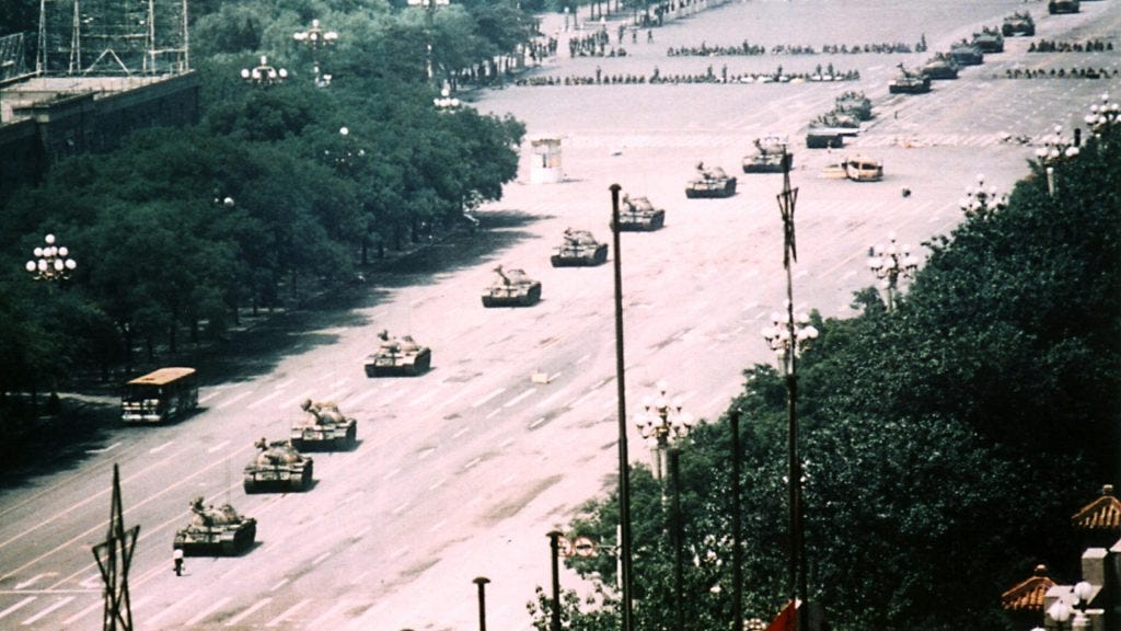
Think about your memory of the Tank Man in Tiananmen Square, now look at the image [2]. I bet he's a much smaller part of the frame than you recall, yet he utterly dominates your perception of the image, even when you look at the actual rectilinear image.
> When people talk about how a focal-length "compresses" or "exaggerates" an image, what they're really talking about is perspective. Each field of view carries with it its own perspective.
Completely agree. What is happening when the focal length of a camera is changed is that the distance of the vanishing points relative to the scene is changing.
I teach perspective in my drawing class. Few subjects are as difficult to convey. Using 3d animations has helped a lot…
The way I've always explained it to people as a photographer: your position with regard to the subject determines the perspective, which is the relationship between objects in the composition. Your choice of focal length determines what field of view/image area of that perspective that you want to capture.
And yes, to agree with a parent comment, this is something that zoom lenses have rotted the brains of many photographers on. People stand wherever is convenient and then zoom to fit the subjects, rather than thinking first about how they want the elements to be placed within the image. You should move to where the elements have the proper relationship, then figure out your field of view from there.
To use the Jaws example: if you want the tent in the frame, you need to be close and go wide. If you want to exclude the tent from the frame, you go farther away and zoom in. As a photographer, you need to make that decision about your composition first, and then choose the position that gives you that, and then select your field of view last.
It's hugely beneficial imo to work with a 3-lens kit or something similar (eg 28mm, 50mm, 105mm) for at least a little while, to really force you to think about what you want from a particular exposure/composition.
A useful implication of this: you get the exact same perspective from taking a picture with a wide angle lens and cropping it to your desired composition, as if you had taken the same photo with a long lens and not cropped it at all. You just get less resolution - so it's obviously desirable to use a longer lens if you have one - but the perspective is the same either way. Similarly - if your lens isn't wide enough, you can stitch together multiple exposures and it will be the same as if you had used a wider lens. Perspective is completely independent of focal length of the lens, it's purely a property that emerges from the relative positions of the subject and photographer. All the lens is doing is picking a "crop".
(to get really really tangential: this is one of the problems I have with "photojournalism" as a field of photography and photojournalism contests in particular, because it completely forbids things like cropping as somehow tampering with the essence of an image. But cropping is a natural part of composition, you do it with your lens even if you are not doing it in photoshop. The photographer (if they're good) chose to exclude the mother idly smoking a cig as she waits for the bus and compose the screaming baby in the carriage instead. Pretending like there is a "platonic truth" to an image because it "wasn't edited" despite being deliberately constructed by a photographer with an agenda (towards drama and impact, if nothing else) and editorial and artistic license is a microcosm of the way modern media feigns complete neutrality and unbiasedness by "just reporting facts" while completely ignoring the agendas of those who choose what facts are reported and the framing used. Anyway, those "photojournalism contests" should really be called "straight-out-of-camera" contests, and even then there is still processing happening. There is no platonic "right" way to process a RAW into a JPG, even if it's the camera doing it itself. But "straight-out-of-camera awards wouldn't be something that sounds important enough to give a bunch of money and adulation over :])
> There is no platonic "right" way to process a RAW into a JPG,
This. So much this. RAW to JPEG conversion is an opinionated act. Just look at the different way phones take pictures. And this isn’t even getting into lens and sensor design.
Google explicitly does a lot of computational photography. That what makes Pixel phones produce pretty decent images out of relatively humble hardware.
Yes, this has gotten even wackier in the era of "neural image enhancement". A phone pic isn't a picture, it's a "DLSS of a picture", or "deep dream of a picture".
And to agree with grandparent - developing a photo has never been a neutral act, whether it's digital or film. The choice of developer and processing has enormous impact on an image. It can increase or reduce contrast, grain, sharpness, etc which can completely change the feel of an image. And that's not just developer choice and times/temps, but things like selenium/chromium/mercury intensification, staining developers (that modulate image contrast/etc) like pyrocat, etc.
All of modern photoshopping evolved from analog techniques - they call it an "unsharp mask" because photographers would actually make a mask using a blurred copy of the image, which cancels out some of the signal and increases the sharpness of the remaining edges. And even before the negative is developed, you can do all kinds of things to control the feel of the image.
In fact for about the first 1/3 of photography's existence it was practically necessary to do intensification - you will find tons of references to it in older guides.
> When people talk about how a focal-length "compresses" or "exaggerates" an image, what they're really talking about is perspective. Each field of view carries with it its own perspective.
This is kind of a misconception because what creates perspective distortion is not a given field of view, but the distance to the subject. That's why short (50-100 mm) macro lenses have a lot of perspective despite a clearly tele angle of view; you get very close to the subject. Someone using a 55 mm macro lens for photography of small products tends to be pretty obvious because of the strong perspective, things look distorted and "bulging".
Of course subject size / angle of view => distance so it still kinda works.
And, if you used an infinite zoom macro lens on a subject infinitely far away, it would not have perspective at all but instead appear as an isometric view. Where does one find an infinitely large lens? Don't worry, you can't afford it anyway. It costs infinite money.
Jokes aside, the math on this really works out. Orthogonal projection is the limit as d tends to infinity of perspective projection.
Yeah, I was going to point out that out when he talked about the portrait. It's not really about the focal length but about the distance you normally look at people (although your brain does a lot of compensation for wonky perspectives). Focal length doesn't change the perspective, but it just crops the image. Your feet changes the perspective.
Right, this is how I understand it too. Is it not true if you took two photos of the same subject, with say a 24mmm lens and 70mm lens, and the then cropped and enlarged the image from the 24mm lens shot, you'd end up with the same image with the same perspective?
Tank Man is not a good example here, as it is not just one image. People might remember [1], but never seen [2] or not even be aware that there is a full video of the event [3] as well. And of course depending on where you viewed it, it might have been cropped, photoshopped or taken from the video.
In an important sense, all photography is compatible with linear perspective. Most lenses aim to closely emulate rectilinear perspective, and those that don't are still constrained by the location of the lens in space.
A pinhole camera can see certain points in any scene, and not others. These points are the same points as a traditional linear perspective rendering with the same viewpoint would represent. Now, lenses do sometimes distort things, but they can't see areas of the scene that are occluded: light travels in straight lines. IMO there is something really straightforward about this situation. Any image is constrained by the lines of sight from the viewpoint, and linear perspective is just a projection in which to display this data, which is (to a very close approximation) the same, however you capture the image. So linear perspective, from this point of view, has little or nothing to do with lens-based media. It's a total commonplace of image formation and it doesn't have any consequences for how you use the camera to portray depth. Those decisions are unrelated to perspective. The fact that the lens can only see non-occluded points in the scene is the determining factor.
The article is about more creative problems that arise when an artist interprets a scene, unconstrained by geometry in a way cameras never are. "This paper points out that artists almost never use “correct” linear perspective"
No, the Tank Man picture isn't surprising at all. The defining property of that image is that he is small, but willing to stand up to those tanks. My memory was correct -- it is a picture of a very small object standing in front of several extremely large objects.
I ended up reading one of the referenced articles too since it captured my interest https://www.gamedeveloper.com/disciplines/fovo-a-new-3d-rend... all of this looks interesting. I would love to add these correction and similar to my game engine to experiment with it, but fovotec seems to have to be paid/contacted for. I might try and replicate what the author of the main article showed at the end. Does anyone know of any more references to the 3d rendering side of this topic?
An important thing missed here: according to the EXIF data in them, these photos are all taken with an iPhone XS. That means they are taken with a tiny wide angle lens. You'd get a very different shot if you took out a dedicated camera with a physically larger lens and a smaller angle.
The overall thrust of this article touches on this when it starts discussing different focal lengths, but the fact that the engineers at Apple made a particular set of choices with their lenses that are a compromise between "what can be achieved with a tiny flat lens measured in millimeters" and "what provides a mostly-acceptable image in any situation", and are very not the choices one might make for specifically photographing a portrait or a landscape or whatever, is really never remarked on.
All else being equal, switching to a longer lens won't make the relative size of the elements of the image change at all.
You can simulate the results just by cropping photos taken with the wide iPhone lens. There will be no difference between the perspective of a cropped iPhone picture and an uncropped picture with a longer lens.
Of course such cropping will be likely to throw stuff away from the borders of the image that you'd rather keep, because you composed before you cropped. To avoid losing stuff on the edges, you'd have had to stand further away from your subject, which happens naturally when you're shooting with a longer lens. But you could have stood further away, shot with an iPhone, and then cropped in, and the only difference between that and a "true" zoom lens is that it's probably blurrier because you are working with fewer pixels.
(the above is only true for rectilinear lenses, it's the linearity of the perspective that means that zooming == cropping)
The article is about how when a human looks at a scene, you'll see quite a wide angle, but when you take a photo that covers a similar angle to what you're perceiving, you end up with an image that seems to exaggerate the sense of depth that you had at the time. This is at least partly because human eyes aren't rectilinear; you can shoot with a non-rectilinear lens but then all the straight lines you expect... aren't.
A skilled artist can produce a scene with 1) straight lines 2) a similar field of view, and 3) "natural" depth, as in the Turner painting in the article. To do this you have to depart from linear perspective. You couldn't get Turner's painting just by standing further away; he's doing something rather more complicated.
> All else being equal, switching to a longer lens won't make the relative size of the elements of the image change at all.
You can simulate the results just by cropping photos taken with the wide iPhone lens. There will be no difference between the perspective of a cropped iPhone picture and an uncropped picture with a longer lens.
Right. I haven't read the article yet, but perspective is about where you are not what kind of lens you are using. A new perspective cannot be simulated by cropping or distorting an image.
The article mentions "Correct" perspective several times and seems like it is leading into an explanation of why 50mm is generally accepted as the most natural match to the human eye's perspective. But, it never really gets there.
You can figure out "natural" focal length by taking a printed photograph, holding it at a comfortable viewing distance, and measuring that distance. Now, scale all of those distances down until the photo is the size of your imaging surface (24x36mm for 135 film, better known these days as "full-frame").
Normally, for a 4x5" photo, you'll naturally hold it about 6" from your face, which is pretty close to 150mm. Ergo, the "normal" lens for 4x5 cameras was 150mm. If you scale that down to the "35mm" 24x36 frame, though, you'll discover that that's closer to 40mm. This is not a mistake; IIRC, one of the early 135 camera makers found it easier to make a 50mm lens than a 40mm lens, and it's stuck ever since.
It so happens that a normal lens has a FOV of about 1 radian, so the normal focal length is approximately the diagonal of the image surface. A proof of that is left as an exercise for the reader.
I think that "naturally" and "pretty close" in that method are carrying a lot of weight.
It is easy enough to hold up an SLR with a 50mm and see that the size of an object in the viewfinder is essentially equal to what you see with your eye. It's almost like just looking through a piece of flat glass (apart from the slightly shift due to the lens being positioned below the viewfinder.)
> This is not a mistake; IIRC, one of the early 135 camera makers found it easier to make a 50mm lens than a 40mm lens, and it's stuck ever since.
"lens coverage" is the size of the image circle that's projected by a lens. You need (or at least, generally want) an image circle that's big enough to cover your negative or sensor.
lens coverage is actually something that is determined by the formula of the lens - a Super Angulon 90/8 has more coverage (will throw a larger image circle) than an Angulon 90/6.3 despite the fact that they are both 90mm lenses. And moreover it is actually something that (if you are looking at it at a formula level) is measured in degrees. You have a triangle that is formed by the nodal point of the lens, the center of the film, and the edge of the image circle, and the lens coverage (in degrees) determines that angle.
But, if you take the same lens formula and you make it longer, that leg of the triangle gets bigger too! At infinity, a 90mm lens will need to be 90mm from the film (backfocal distance) while a 75mm would only be 75mm from the film. So a 90mm Super Angulon will have the same angle of coverage, but that means more coverage (in mm) than a 75mm Super Angulon would have, because of the longer focal length. So a 90mm Super Angulon would cover 5x7 film, but a 75mm Super Angulon would only cover 4x5 film.
Anyway, point being, 40mm is really tight on a Cooke Triplet-type lens (or really, even Tessars) to cover a 35mm frame of film, especially in the faster configurations with wider apertures. It works, but really you're going to get a lot of softness and maybe even vignetting wide open. But making it 50mm gives you some extra image circle to play with and increases the angle of sharp coverage as well. 50mm is generally close enough that people don't really notice the difference anyway.
Some lenses actually went even farther, early SLRs struggled to get enough distance to fit the mirror in, and the way they worked around it was to make the lenses even longer (often 58mm) to give some extra room to fit the mirror. Early in the development of SLRs it was not possible at all to do wide angle lenses because (being only let's say 35mm long) they could not focus to infinity when used with a mirror box that needed 50mm of clearance. In a rangefinder design (like a Biogon), you can have glass elements that get very close to the film but on a SLR that's where the mirror has to go. The fix was the Angénieux retrofocus design, which was a reverse-telephoto design that pushed the nodal point behind the lens, so the actual glass could be farther away, but the nodal point only had to be (eg) 35mm away. This design was directly copied by a couple companies, including Pentax, who sold it for a number of years as the Pentax/Takumar 35/3.5 and the Pentax/Takumar 6x7 75/4.5.
Technically long lenses and telephoto lenses are not the same thing. A telephoto lens has a focal length shorter than its physical length (or, focal length longer than its nodal distance). Generally this is done with a specific arrangement of positive and negative elements called a "telephoto group". In contrast I have a Takumar 500mm f/5 lens that is not a telephoto lens, it's actually 500mm long and has a single doublet group at the very end, so it is like a spyglass that you mount on your camera, not actually a telephoto. The correct terminology for a lens that has a narrow field of view is a "long lens", not "telephoto".
The angle of coverage changes for many lenses as you stop them down (however this is not universally true). There is often also a "angle of sharp coverage" where the image gets soft, but is still illuminated towards the edge. On many 35mm lenses this is "cropped" internally using baffles but on large format you get to determine that yourself. Again, stopping down will usually improve the angle of sharp coverage.
The "field of view" of a lens is dependent on the coverage and the image size. If you put a 35mm film in a 4x5 image circle projected by a 90mm lens, it works fine, but you're only getting a part of the possible field of view of the lens. And it is the exact same field of view you would get with a plain old 90mm lens from the 35mm camera manufacturer's lineup. So in large format you end up with a situation where that 90mm lens could be "wide on 4x5, superwide on 5x7", because you can pick your sensor size as well. Just like a lens can be "normal on full frame, long on crop sensor" for the smaller sensors.
Most of the simpler modern lens types have been known for a long time! For example the 50mm lens on your DSLR is likely a Planar type, the Zeiss Planar was invented in 1896. However, for many of them the materials science had to catch up to really make them practical - early lens design favored fewer elements and cemented groups because every air-glass interface would lose some light and you'd end up with very low contrast. Lens coatings were developed slightly before WW2 and were a key enabler for more advanced lens types, along with the later inventions of more advanced glass compositions (particularly fluorite elements), aspheric surfaces, and computer-aided design. It's not a coincidence that there's a cambrian explosion of lens design in the 50s/60s, that's when the material science really caught up!
Anyway many of these things are tangentially observable on 35mm, but of course the intent there is to provide a streamlined experience, all of this is exposed full force in large format. Hopefully this explains some of the ideas behind quirks of lenses that people might have wondered about.
Yeah, it’s sort of a semi-conventional (and somewhat controversial) statement in the film/photo world to say that 50mm lens on a full frame sensor/35mm stock is “what people see.”
Some argue it’s closer to 35-40mm. Some argue it’s all moot. Maybe he ultimately just decided not to firmly stick by it haha
The size of the lens is actually completely irrelevant. Anyone who has done any 3D work can tell you the size of the lens has absolutely no effect on perspective. The mathematical model of a camera in a 3D renderer doesn't have a parameter for lens diameter. There's no way to make an image appear as if it has been taken by a really tiny camera or a really huge camera. At the worst the huge camera will not physically fit in certain spaces.
All the size of the lens affects is how much light can come into the camera, which in turn affects the quality of the photo with less than ideal lighting conditions.
Aperture size has an effect on depth of field (the degree to which points that are out of focus are blurred). I think in practical cameras, aperture size isn't constant as you vary camera size, so that makes the scale relevant. But I'm not 100% sure how photography terminology like "stops" maps to the underlying geometry, so take this with a grain of salt.
The "f/" in aperture settings literally stands for "focal length divided by ...". e.g, an f/2 aperture on a 50mm lens has a diameter of 25mm.
One aperture stop corresponds to a scaling factor of sqrt(2), because the area of the aperture scales with the square of the diameter, and halving the area results in half the light (and 1/1.414... of the aperture diameter)
More specifically the f/ number relates to the size of the entrance pupil (the optical image of the physical aperture stop, as seen through the front of the lens) rather than the size of the physical aperture. Depending on the construction of the lens and where in the lens the aperture is located, the two can differ quite a lot.
Ignoring "non-geometric" effects like depth of field, the only optical parameter that matters here is the visible angle (a function of focal length and crop factor).
Parameters like the size of the aperture are massively important in general, but not for determining the relative size of objects within the scene.
I've noticed this a lot at home. I live in western WA and am lucky to have, on a clear day, a pretty breathtaking view of Mt. Rainier. But pictures never do justice to the sense of scale you get in person. It looks enormous on the horizon but in pictures it's rather small and mundane.
This effect can be very pronounced even in the naked eye. Stand behind a window and observe something large and distant. Then back away to the far side of the room; the same object now fills the window. I'm often reminded of this by a particular row of tower blocks.
I think this is what separates a good photographer from... me.
I've tried various zoom levels before—and aspect ratios, focal lengths, etc—but I can never capture in an image what I'm seeing with my eyes. Either the enormous mountain is a tiny feature off in the distance, or it fills the frame and all context is lost. I can't seem to find a framing that communicates both the grandness of the subject, and the larger context it's situated in.
Obviously a 2D, cropped image of the landscape is going to have to lose information compared to my 3D, panoramic view of it. But I also know I've seen good photos of these types of things. What are those photographers doing to capture that?
Two things that might help your images say what you'd like them to say:
1) For depth, try making images that have a "foreground, middle-ground, and background". The 24-28mm-equivalent lenses on smartphones are a perfect training ground for this kind of composition, as it is easier to select foreground elements.
2) Dodging and burning: The human eye is drawn to bright parts of an image. Gently darkening things that are less-important and gently highlighting things (and paths) that are more important can have a huge impact on the perception of an image. The Snapseed app, again on a smartphone, offers a very-intuitive interface (look for the "brush" tool) for learning to dodge and burn.
> I can never capture in an image what I'm seeing with my eyes. Either the enormous mountain is a tiny feature off in the distance, or it fills the frame and all context is lost
Try adding a sense of depth by having a foreground, middle and back.
Look at good landscape photos of mountains or other large features and you’ll see they almost always do this. By having near, mid and far elements of interest you add a sense of scale to the photo.
Back when SlR cameras were newish, they came with 55mm lenses. That seemed to match what one eye sees. (You couldn’t look though the camera and open the other eye and it seemed to work.) I would have thought wider as You can see more than the 50mm lens shows you.
This is all very interesting but it’s not really about perspective. Perspective is fixed based on the relative positions of the objects. What changes is how we perceive perspective when we squash a representation of a wide angle of view - ie what our eyes actually see - into a much smaller area (ie a photo or painting).
Stated like that it’s obvious that they can’t possibly look the same and you either get disappointment - the photo doesn’t look how you saw the scene - or if you’re an artist you deviate from reality to make a better painting.
If you make a really big photo and stand at the right viewing distance everything will look right
Correct. Perspective only depends on where the eye is in relation to where the objects are. The fact that the drawings don't match the photos isn't because of perspective, but instead because of projection. Similarly, a fisheye lens has the same perspective as a rectilinear lens, but has a different projection.
Yes, exactly. You need only look at the angles of the crenellated roof of the tower on the left.
While the kinds of photographic manipulations that the article ends up discussing are technically and artistically interesting, almost everything else discussed seems to be based on a fundamental misapprehension about what is really going on.
Not quite the same, but I quite enjoyed PicPlane https://blog.mattbierner.com/pic-plane-1-1/ by Matt Bierner who has quite a few of similar experimental visual perception apps.
This is a topic where having knowledge of art history helps quite a lot. One could make an entire university course around the ways artists have grappled with perspective over time. Just coming to grips with the fact that linear perspective is something we learn to understand as "natural", as communicating a scene or image in such and such a way, despite it being an artistic technique for representing 3d shapes on a 2d surface from a fixed point(s) of view, can be a big way to get people over the hump and to appreciate non-representational art, or even just the works of 20th and 19th century modernist painters like Picasso or Cezanne.
Ahh, I love this article. I'm among those that dislike all my photos with small objects that don't look as I see them. I guess building photo optics that do not use linear perspective is out of the question. I haven't got time to read all the papers they are referencing (currently searching for a new computer vision job, and there is so much in that area that I can't really read everything), but I wonder how many techniques to computationally change the perspective of the image depend on LIDAR depth information, how many on guessing depth via some other means (e.g. neural networks), and how many on neither?
I remember reading bit more on the work from fovotec authors (Pepperell et al), and while there are some interesting ideas in there, the majority of papers etc had heavy snakeoil/pseudoscience smell. It would be nice if someone grabbed those ideas and took a more rigorous approach to solve the same problems.
That being said, the blog post is nice survey of the wider field so that's nice at least.
A sentence at the end of the article helped me understand why looking at photos on a 12.9" iPad feels uniquely pleasurable to me: I can, and naturally do, hold the device such that the image fills my focal length.
Phones are of course too small, but my laptop screen, while larger, isn't as nice, even for photos in landscape perspective, because it's subjectively smaller in terms of the field of view it fills. I'm estimating I naturally use a laptop about twice as far from my eyes as an iPad.
This makes me think of cinema. Most people who watch films at home watch them on a far smaller screen than they were made for and the picture encompasses a far smaller portion of the field of view. Cinemascope films are supposed to fill almost all of the horizontal field of view. IMAX films are supposed to fill your entire field of view (extending right into the peripheral).
I'm sure many people have tried, like me, to sit closer to the screen so it fills more of your field of view. But even though the angle might be the same, the experience is not. This is true even if you view with one eye. So it makes me think there is something else at play other than just viewing angles.
This article was fascinating and I can easily see this being the next feature that smartphone manufacturers will add to their camera apps. Most of the time I'm taking a photo I'm trying for something that will look really cool when I post it online, I'm not after a scientifically "accurate" representation of the scene.
Smartphone hardware has hit a temporary wall that might last another 5 or 10 years, software is the only battleground right now.
Linear perspective has some fun implications that I think about a lot.
Apply a linear operator to a line and you get another line. This is obvious but the inverse is also true: if a line is a result of a linear operator the input was also a line. This is fun to think about when looking at jet contrails and bridges, the milkyway and pretty much any curve you have looked at your whole life. If it isn't straight as you see it then it's not straight in reality.
Really interesting article! For anyone curious about perspective in art, see the book "Perspective Made Easy" by Ernest Norling. It is easy to follow and has simple helpful exercises.
A more technical and challenging book is "How to Draw" by Scott Robertson. That one is good if you want more technical theory understanding (plus the illustrations are amazing).
Must have been quite an event, the invention of perspective in art. Imagine the feeling of looking upon such a drawing when you had seen nothing like it before. I imagine it must have been utterly transformative to your perception of what is possible, like someone showing you a new colour.
If you like this there's actually a lot of work on this kind of topic in media studies! I particularly liked Nonhuman Photography[1] by Joanna Zylinska.
Reminds me of this: https://news.ycombinator.com/item?id=26795290 the FOVO Renderer that uses a variable zoom based on 2D distance from the center of focus, which is more similar to human vision.
This is dancing around the real issue - there are many different district processes that our eyes use which fuse into a sense of 'being there'. Any attempt to compress this into a single monographic static image will be a compromise.
One of the coolest things about the Renaissance was the discovery of how to render perspective in drawings and paintings. The technique was spread greatly by the Italian book de Pictura, written by the humanist and artist Leon Battista Alberti in 1435.
It reminds me of viral art tutorials you see spread on Twitter today, for things like video game artists and developers. The illustrations still hold up, hundreds of years later: https://twitter.com/Doomlaser/status/978211776167923712
Prior to this discovery and the book, Italian paintings had a very muddled perspective, because people just didn't know how it worked. You'd also often see Madonna and Child paintings with an absurdly large baby, to signal divinity:
this is fascinating stuff, the software experiments made me wonder if lightfield cameras will do better or at least enable smarter perspective algorithms
Most of this article is not very informative, it boils down to the fact that to get better photos you should just use a longer focal length aka zoom in a bit and also take a few steps back.
Would you kindly stop breaking the site guidelines? You've been doing it repeatedly, unfortunately, and we've had to ask you repeatedly not to.
In this case you broke this one: "Please don't comment on whether someone read an article. "Did you even read the article? It mentions that" can be shortened to "The article mentions that.""
More generally, you've been breaking this one: "Be kind. Don't be snarky."
There has been a lot of press around the HN moderation, mostly shock at the small size of the team doing it, but also around the bigger point, which is the care that HN shows about keeping its community in some sort of order.
I've built and run huge online communities in the past, and they have died by 1000 paper cuts. Little bits of snark building up like fat on the walls of an artery until the clot ruptures. I've tried installing moderators I trusted, but without exception each one would turn into a fascist dictator stomping on accounts until everyone feared to speak. I had to fire them all.
The biggest problem here is that HN moderators are not replicable or replaceable. There is a quote I can't find about how the type of person who wants to be a politician is exactly the sort you don't want. The reason HN mods are so good is because they didn't want the job, they fell into it.
But it also has to be heartbreaking work, like those in the Third World who moderate the main social networks watching beheadings and child abuse all day. Eventually it will take its toll and I don't know how the fuck HN will operate when it has to find replacements.
No worries, I know you're busy, and the last couple of weeks must have been especially draining. You don't owe me the satisfaction of my curiosity. (And, just in case there's any misunderstanding, I am possibly the person worst suited for helping out with moderation that I know, so I'm not offering help --- though I wish I could.)
My apologies. I haven't been in the best of moods lately. I will stick more firmly to the guidelines in the future. I really appreciate the civility of the discussion here compared to the rest of the net, and I want to keep it that way.
No to be preachy, but if you’re struggling a lot make sure you’re doing enough self care, I like long walks, it’s so easy to forget to make time when so much is happening in the world.
That's a direct reference to pg's original concept of middlebrow dismissal. We just changed the word from 'middlebrow' to 'shallow' because the word 'middlebrow' often comes across as a putdown and also often comes across as labeling a person rather than a post.
Commenters who've actually read an article are always welcome to respond with accurate, interesting information from the article. That's a fine contribution. What's not fine is the "did you even read the article" internet trope.
To help contextualize this response: The entire opening of the article feels like an extremely heavy handed introduction to "Photography 103 - Focal Length and How to Use It" without ever really explaining focal length even while a basic understanding of focal length & "compression" remains relevant to the topic the article veers into.
I should have been more clear. I'm basically agreeing with you. It feels like the article is constantly about to say something like "Here's an example where I used a 50mm and you can see how much more closely it matches the painting and my recollection" or something like that before then going on to talk about how perspective in photography is essentially a tradeoff with field-of-view. But it... just doesn't do that and so ends up with this awkward feeling mismatch with reader expectation (for me, at least).
I don't necessarily begrudge the article for it but I do share your frustration.